



1. Space sidebar
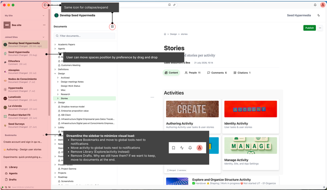
Bookmark and activity will be part of global tools.
Activity:
Will have filters to navigate by spaces.
By default it will show the activity of the space you are in, but if you navigate back and forth other places it will remain in the last place you were.
Bookmarks: Will have filters to navigate through by conversation, documents, site... (need to design this doc)
User should be able to bookmark a comment @Untitled Contact
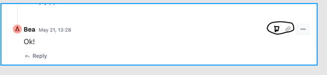
Add icons before the bookmark list item
Make the X to remove grey not red
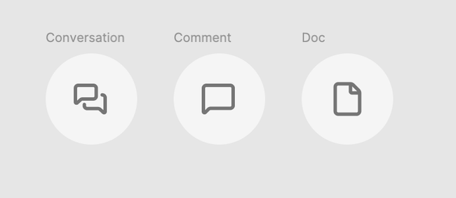
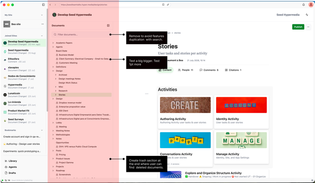
2. Document directory
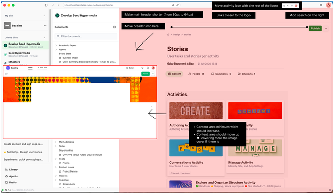
3. Content area
Breadcrumb and CTA's is what remain sticky
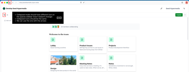
Collapse mode for sidebars consistency
Still here I believe content should be up covering more the image, wider (we said 900px right?) and header smaller.
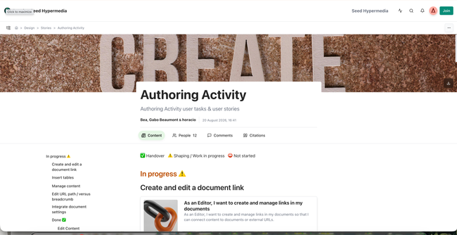
Results on the document header negative margin
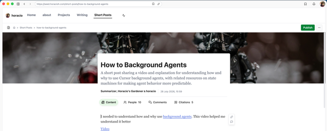
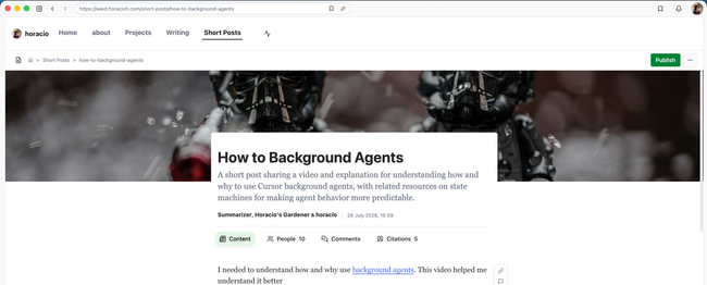
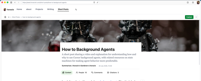
Nicer sites browser sidebar more cohesive with the document browser.
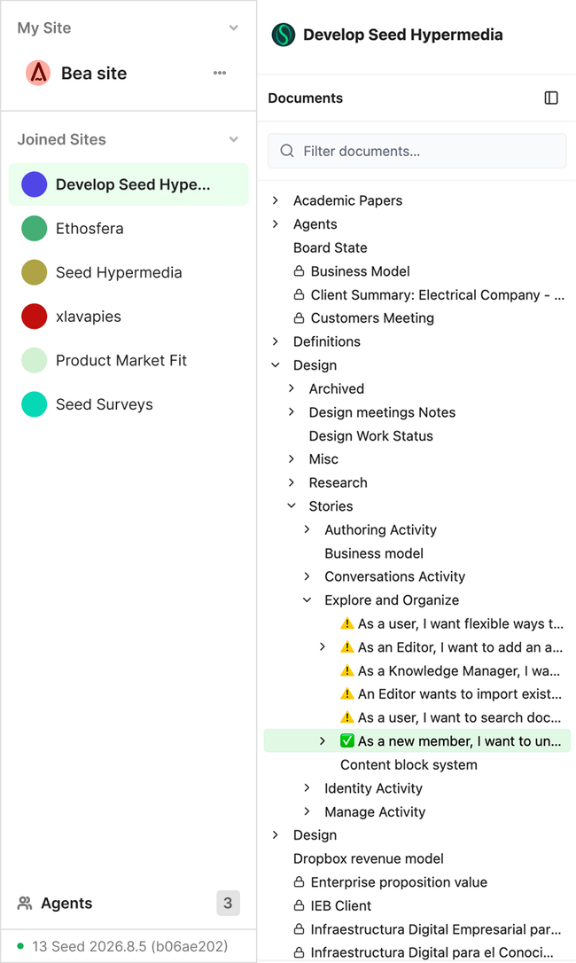
White background
Remove second line on space name.
Do not change order by activity, keep it fixed.
Be able to drag and drop spaces by order preference.
Hey @Untitled Contact in the main UX work for foundations the spaces sidebar design was like this.
Notes from Gabo: Layout Problems and Improvements
Do you like what you are reading? Subscribe to receive updates.
Unsubscribe anytime